 Today (Jan 5th, 2020) marks the twentieth anniversary of the introduction of Microsoft’s Internet Explorer 5 Macintosh Edition (MacIE 5). This was both the most important release of Internet Explorer for the Mac and the last. It was also the first large third-party Mac application to ship for Mac OS X, and the first mainstream web browser to embrace standards compliant web content.
This anniversary is also significant for me as MacIE 5 was first product I worked on when I started working at Microsoft in summer of 1999. I was 22 years old and I was thrown into the deep end of the browser wars, the Microsoft anti-trust trial, and the love/hate relationship between Microsoft and Apple. I don’t want to delve into the details of what made MacIE 5 special because my friend Tantek Çelik has already documented that on his blog. Rather I want to focus on the inside story of how and why it was developed, and some of the people and personalities that shaped it’s success and eventual demise.
I’ve just posted a Twitter thread that goes into some details bout the events leading up to and just after the unveiling of MacIE 5 by Steve Jobs:
1/ Today marks the twentieth anniversary of the introduction of Microsoft’s Internet Explorer 5 for Mac. This was both the most important release of Internet Explorer for the Mac, and the last release. Here are some anecdotes and thoughts from an insider’s perspective. [thread] pic.twitter.com/TLiloQX0DU
— Jimmy Grewal (@jimmyg) January 5, 2020
I also want to share a detailed history of MacIE 5’s bold UI design, dubbed “New Look” internally. This history has been compiled by Maf Vosburgh, the developer who conceived and executed the implementation of this major UI redesign:
New Look : How I set the look of Mac IE 5, possibly kickstarted Aqua (sorry), and invented translucent blurred windows, in the 1990s.
Maf Vosburgh, January 2020, California
In the summer of 1998 I moved from London to San Jose, California to write code for Mac IE 5 at Microsoft. I was supposed to go work for Apple in Cupertino, but the Apple recruiter screwed up my offer paperwork, and Microsoft snapped me up.
I should explain that my background was at a BBC spinoff called “MMC”, coding Mac multimedia software for CD-ROMs like “3D Atlas” and Douglas Adams’ “Last Chance to See”. I was used to working with graphic designers. I’d do a rough prototype, they would do a beautiful image of how it really ought to look, and after a bit of back and forth we’d have a lovely product. MMC started off using tools like HyperCard supplemented by our custom plug-ins, but by the mid-90s we had switched to native code and never looked back.
Coming from the artist-influenced multimedia world, the visual style Microsoft had in progress for Mac IE 5 looked ancient to me. Everything was the MacOS platinum style, shades of gray like cement, with a horde of tiny 16 by 16 pixel toolbar icons (in 4-bit color with a 1 bit mask) most of which had obviously been designed by engineers in a pixel editor like ResEdit.
Meanwhile, Mac hardware of the 1998-1999 era was incredibly vivid, with first the Bondi blue iMac and then a whole palette of iMacs in translucent candy colors with white pinstriped elements. I had posters of them on my office wall. Eventually the whole Mac range had this same vivid design style, and the gray drab interface of MacOS 8, which we matched, seemed left behind. Apple’s demos at the time of their future OS would (which came to be Mac OS X) also used this same gray look. We were building a state-of-the-art new HTML engine for IE 5 (Tasman) and I wanted the chrome to be as modern.
I had the idea of making our browser chrome match the actual hardware you were on. If your Mac’s bezel was Bondi blue, we’d make our UI Bondi blue. That way our “frame” around the web page would match the bezel and so would be seen as part of the background and be distinct from the content. By being more vivid we would paradoxically blend into the background, and look more at home.
I put my idea to the rest of the Mac IE team, and they loved it. We had no graphic artists in our little office in San Jose and I suggested we hire a company called Nykris back in London. Nykris was a digital design company founded by two artists I’d previously worked with at MMC, Nikki Barton and Chris Prior (their first names combined to make the company name) and they had other great people on staff who I trusted, like Graham Bartram.
So somehow the Mac IE5 exec, Dick Craddock, let me, a newly hired engineer, hire a London design agency and I ended up art-directing on our side while also writing the new UI code to make it happen.
Nykris came up with a range of fascinating design sketches, but the sketches that followed the original idea of coordinating with the flavors of the new Apple hardware look, worked the best, and so we followed that path.
Gradually through Spring 1999 a design emerged that started to look like Mac IE 5 as it turned out. Shiny simple button shapes, pinstripes (a 3 pixel repeat made the pattern fine enough to not hurt readability, although it was inconvenient to code).
Mac IE lead, Steve Falkenberg, worked out how to make the system scroll bars match whatever color scheme we were using. He also worked out how to auto-detect what flavor of Mac we were on.
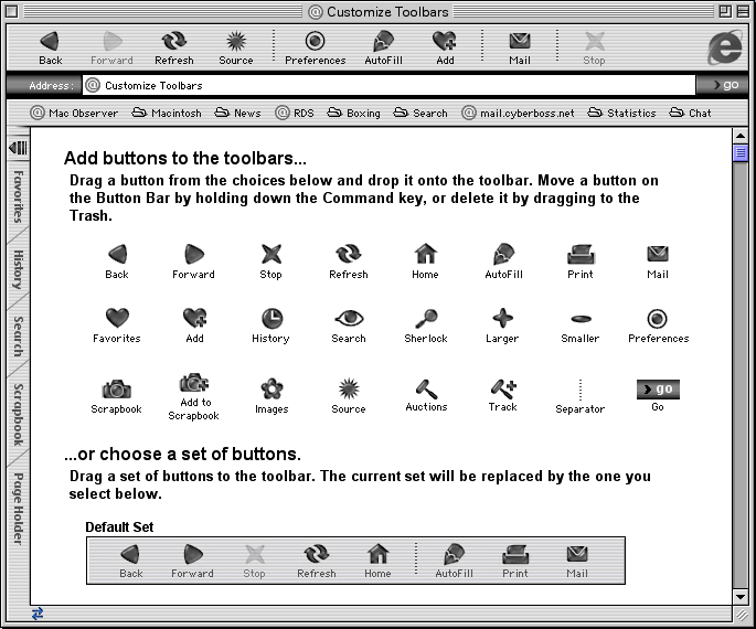
Program Manager, Jimmy Grewal, worked out an elegant UI for customizing toolbar layouts, which has been much imitated since.
Nykris totally redesigned how the tab strip looked and also came up with the idea of the toolbar being able to collapse INTO the tab strip down the left hand side. This gained back lots of vertical screen estate, valuable on the small screens of the day.
As Nykris sent me artwork from London, I was working out how to implement the designs in San Jose, without slowing IE down or using too much memory.
New Look was so secret that it was not in the daily Mac IE 5 builds that our QA and external beta testers were using, so everything had to be switchable on and off with a NEW_LOOK build macro and leave no trace in the regular beta builds, which continued to look like Mac IE 4.x. As I was changing a lot of UI code, keeping both builds working was tricky.
The big 24 bit icons and 8 bit masks with switchable “flavors” had to work in the same memory as the old toolbar system. The new tab code was all custom and everything had to be drawn anti-aliased (lines and text).
It rapidly came together and in Summer 1999 we demoed the secret New Look build of Mac IE5 to Steve Jobs, the first person to see it outside Nykris and a few people on the Mac IE team. Steve gave it his enthusiastic approval. Yeah!
So eventually MacWorld January 2000 came along, the venue for unveiling the Mac IE 5 beta.
Steve Jobs insisted on doing the Mac IE 5 demo himself. Tnis is where things got a little surprising. Steve first showed a new build of Mac OS X which had a new user interface called “Aqua”. This looked, well, just like the Nykris design we’d been using for half a year at that point.
He then demoed IE 5 by showing an experimental Carbon port of it on Mac OS X, and said the UI look was being inherited from the operating system (it was not – Mac IE 5 looked just the same on Mac OS 8 or 9 at the time).
Oh well, that was Steve being Steve.
So did Steve see our Summer 1999 New Look demo and tell his team to create Aqua? Who knows. Our stuff was in any case inspired by Apple’s hardware designs, so I can’t feel too bad about it.
A side note about blurred translucent windows.
Mac IE 5 launched in March 2000 with a blurred translucent autocomplete window, the first time this blurred translucent window thing was ever done. That look is everywhere right now, so people might want to know how that came about.
In the summer of 1999 I had one last big idea. The big white autocomplete window that came up under the address bar as you typed, was bothering me. It covered a lot of the web page, and the page is the star of a web browser. It felt to me like this window was hiding the context of where you are. I wrote a version of the window that made the window translucent (not trivial on MacOS 8), but the readability of the overlayed text was bad. I tried changing the tone of the background image to make it a better background, which was an improvement but still not there. Then I had the idea of also blurring the background content. After all, the eye is used to interpreting sharp foreground objects against the blurred stuff in the background, like reading letters on a shop window. This was an effect that people were used to seeing in pre-made Photoshop artwork but not something that anyone has used realtime as a live effect.
At the time, Gaussian blur was something you’d only do in Photoshop which required a lot of memory and didn’t do it very quickly. Macs did not have the kind of hardware acceleration that modern machines have, in fact most had no actual GPU.
I knew I had to write a Gaussian blur routine that took no noticeable time, used very little memory (even on a large image), and worked on any depth of content. Back then, people ran their Macs in all kinds of color depths, with 8 bit being still common.
The actual magic I came up with involved a bunch of secret programming tricks and math shortcuts and eventually I had a virtually instant blur routine that could process any pixel depth image and tonally adjust the image at the same time. In goes a picture, out comes a picture you can put black text on top of and easily read it.
I could tell once I had the right values dialed in. You could recognize the web page in the background, it felt as if you hadn’t gone anywhere, but you could read the 1990s style 9 pt aliased black type layered on top with virtually no added difficulty. The blur filtered out the high-frequency information from the background and the tonal shift gave you the contrast you needed to read the text.
The Mac IE 5 release of March 27, 2000 included that blurred translucent autocomplete window, despite some management indecision about it because the look was at the time so revolutionary. Later than year I added the effect for conxtextual menus too. Of all the UI stuff I’ve come up with over the years, this has been the most significant in retrospect. It was a key design element of Windows Vista and now iOS and the Mac. Although they almost never get the recipe right. You need blur and toning, either lightening for black text overlay or darkening for white text, and there shouldn’t be so much of either that you lose context.
Unfortunately, the Carbon port of Mac IE on Mac OS X never got the blurred translucent window code (the skeleton crew who finished the Carbon port instead used Mac OS X’s built-in translucency without blur which is not the same thing at all).
I want to extend a special thanks to my friends Tantek, Maf, Dick, Kevin, and Bertrand for refreshing my memory on the events of twenty years ago. I look forward to sharing more anecdotes about the development of MacIE 5 and the relationship between Microsoft and Apple during those years.
Glad to lern how IE’s UI came into existence! I lived through this era, and found IE really stood out. I liked the colorful UI but did not recognize that it anticipated Aqua. (One Reason: I never used the true Aqua-UI. Bad user experiences with a RAM-deprived NeXT made me avoid OS X until the times Aqua was much altered with brushed metal windows and toned down lines.)
You wrote that IE could detect the colour of the Mac it ran on. I was unaware of this feature. Probably it worked only on fruit-coloured iMacs not on tangerine iBooks, and I’m also unsure if it worked on our bondy-iMacs.
Anyway, thank you for contributing to this important point of the history of the Mac.